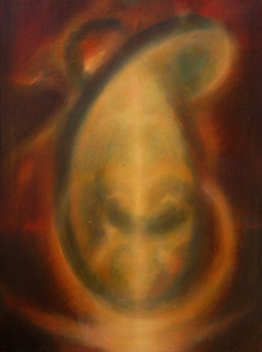
Shane Guffogg: Color Part 1
(Follow me as I research the origins of color and discover how it has inspired the work of Los Angeles based artist Shane Guffogg) - Victoria Chapman
About six months ago I listened to a podcast about color and it really got me thinking about the history of art and Guffogg’s paintings. Working amongst them in the studio, I started to contemplate how the artist uses color to create his visual poetry. The subject of color in art is vast. I began to research it from the beginning and the parts I became particularly interested in, I wrote notes about, and proposed questions to the artist. Like always, I had a great deal of inquiries related to specific art movements and how they may have been re-translated into Guffogg’s work. The artist’s knowledge of art history surpasses anyone I have ever met. We had quite an entertaining dialogue talking about my research. I felt it necessary to include my notes on the topic before asking Guffogg questions, so that the reader can understand where I am headed.
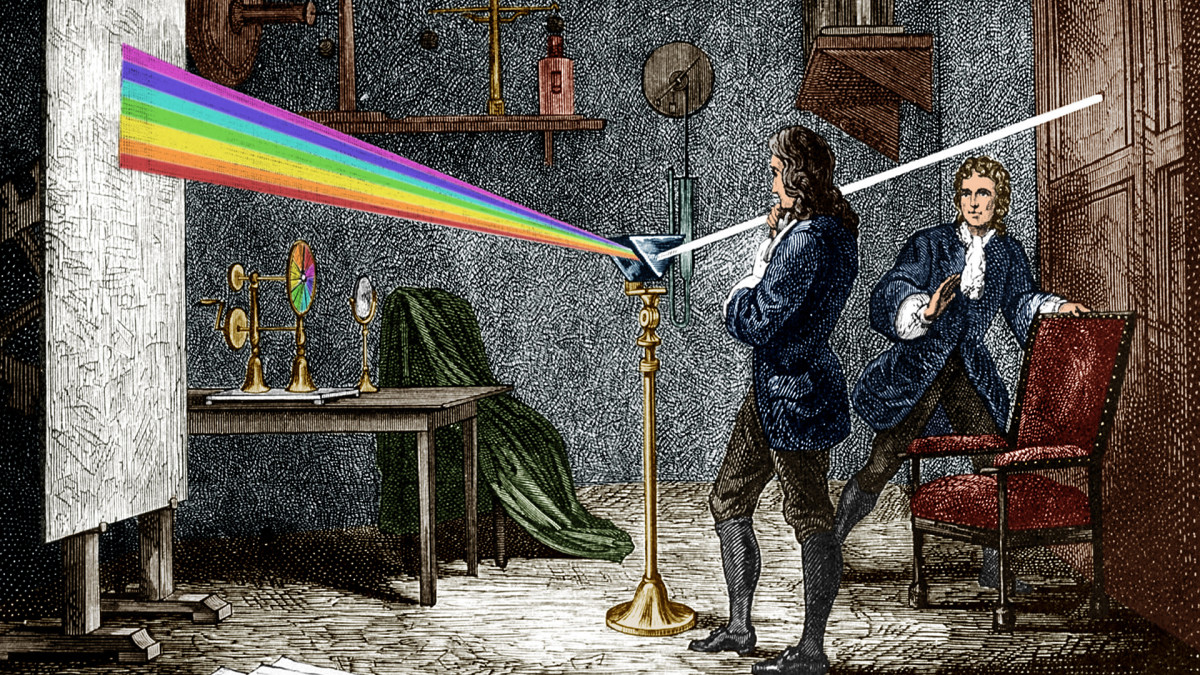
I have learned that our understanding of light and color began with a series of experiments by Sir Isaac Newton, which was first published in 1672. Newton's observation came about when he refracted white light through a prism and discovered that light is made up of red, orange, green, blue and violet. Up until that time (1660), people thought color was a mixture of light and darkness and that it was prisms that colored light. Newton was also keen to understand the conceptual arrangement of color, i.e. a color wheel where he positioned complementary colors opposite primary colors. This was a wonderful tool for artists, which allowed for a contemplative effect through optical contrast. Later in 1708, it was Claude Boutet who designed a “painter’s circle” which was based on Newton’s original circumference of color.
Sir Issac Newton, (1642-1726), was an English mathematician, physicist, astronomer, theologian, and author, who is a key figure in the scientific revolution.
An illustration of one of Sir Issac Newton light experiments published in 1672, where he set up a prism near a window and refracted light moves through a prism and a "rainbow" of color is resolved.
Claude Boutet's 7-color and 12-color painter's circle from 1708, which was based on Newton's circle
With my new understanding of these early documentations on color, what immediately came to mind is, how do you begin a painting? I think of your work in terms of color but they are not Colorfield paintings, they have shape and form. Do you begin with a sketch?
Shane Guffogg: I use to make sketches when I first started painting, but that was primarily because my work was figurative, and therefore, narrative. The drawings were a way for me to work out the story. Now the act of painting is the story. I still draw but they are not studies for a painting. The drawings, if I am just doodling, often hark back to my earlier figurative work and have a surrealist quality to them. The works on paper that I do usually run parallel to the paintings. They quite often enter into a dialogue with the paintings I am currently working on. The colors are usually predetermined and that is based on what I feel a need to see. If I need to see red versus blue or grey, I will work on a red painting or start one. I can't really explain what is behind my needs to see certain colors, and I choose not to think too much about it and just trust my instincts. I guess a quick answer would be my choices are emotional.
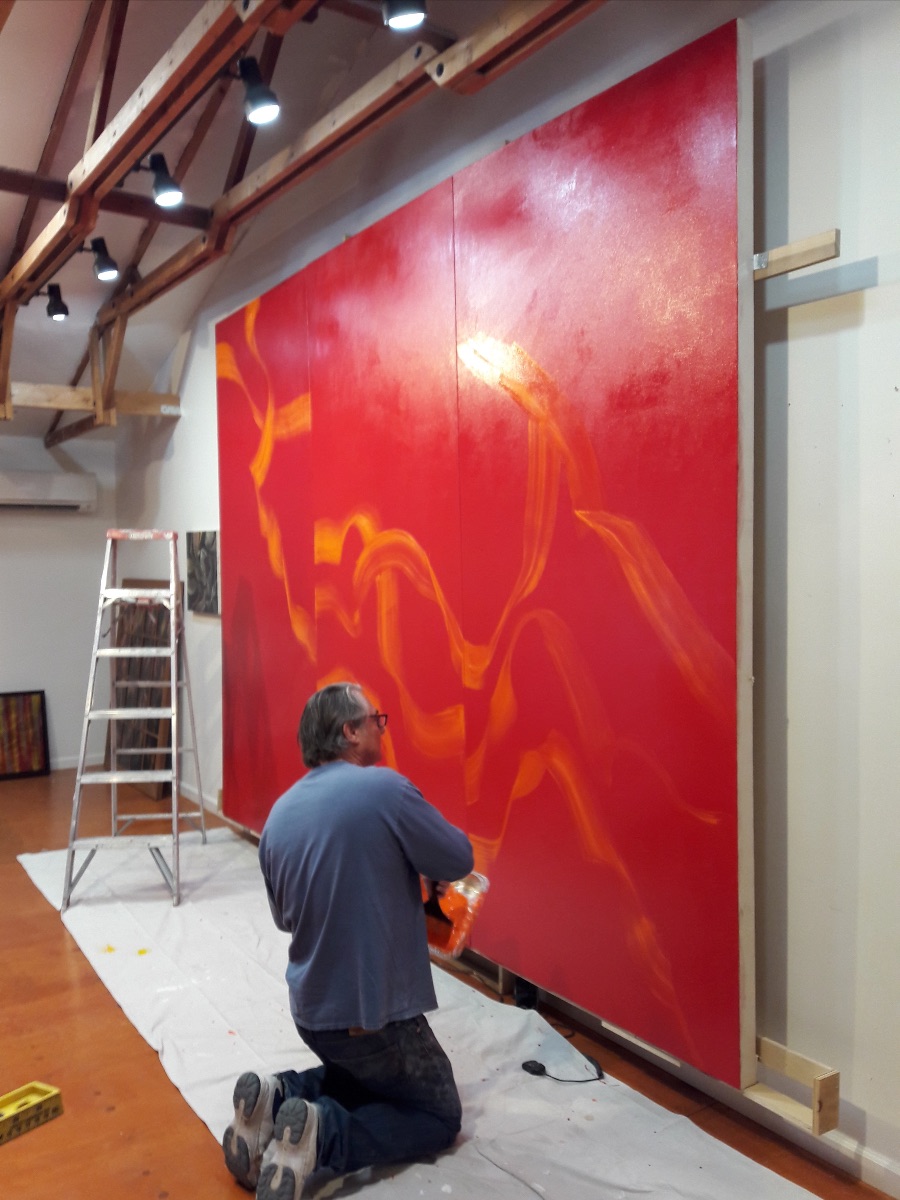
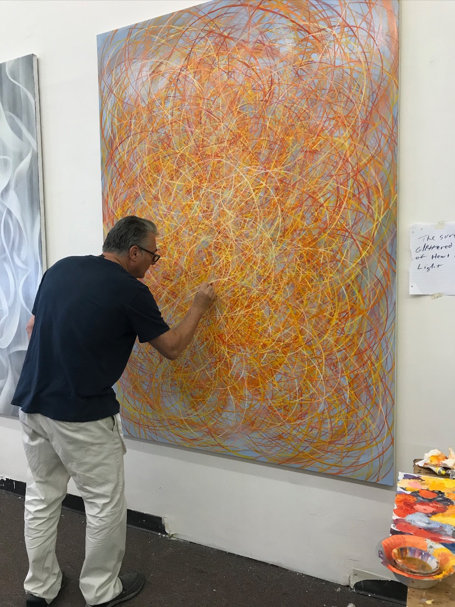
Shane sketching out his painting
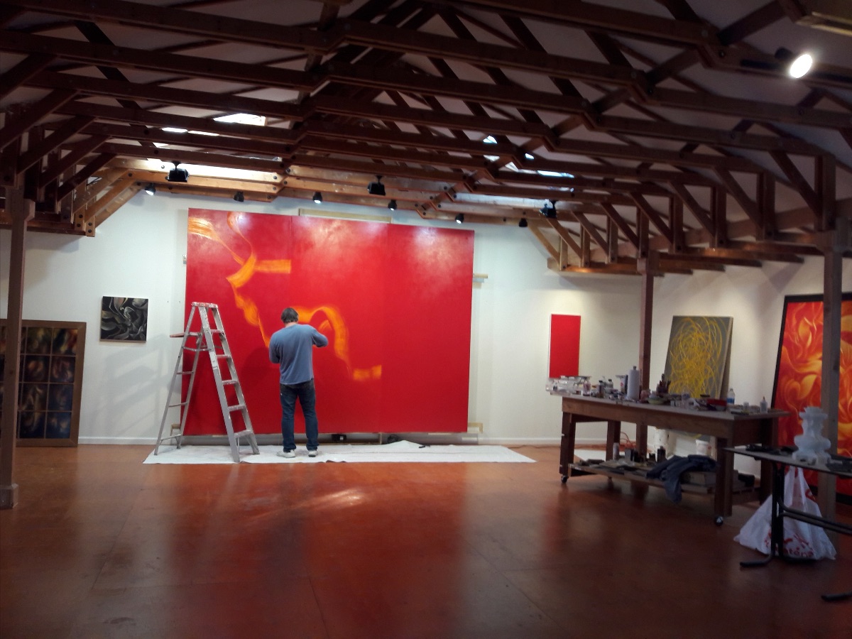
Another view of the artist sketching out his painting
Shane Guffogg, Self-Portrait (with glasses)
pencil on paper, 14 x 11", 1982
I would also like to reference, Johann Wolfgang Goethe, who was a writer and an accomplished scientist. In 1810, he challenged Newton’s theory and concluded that color, as a physical state, has the ability to move through objects and enter one’s eyes. Goethe quickly realized that sensations of color affect us. He continued by citing that the laws of color, including color theory and harmony, not only impact us but are subjective to our visual phenomena.
Goethe's studies of shadows and complementary colors anticipated Hering’s “opponent-color theory” which is one of the bases of our understanding of color vision today. It was Goethe who recorded the sensation of what colors do to us. I believe we are complex and have evolved over time. There is a theory based on Homer's The Iliad, in which the color blue may not have existed until modern times, or at least in the way we think of it today. This is quite a controversial statement. But let's remember the world in Homer’s day (a millennia has separated us) is different than what we know and how we think today.
Johann Wolfgang von Goethe (1749-1832), was a German writer and statesman. His works include novels, poetry, memoirs, literary and aesthetic criticism. Also treatises on botany, anatomy, and color.
Goethe's color circle
The Greek poet Homer (c. 800 BCE–c. 701 BCE), was born sometime between the 12th and 8th centuries BC, possibly near the coast of Asia Minor. He is famous forThe Iliad and The Odyssey, which have had an enormous effect on Western culture. While his personal life still remains a mystery.
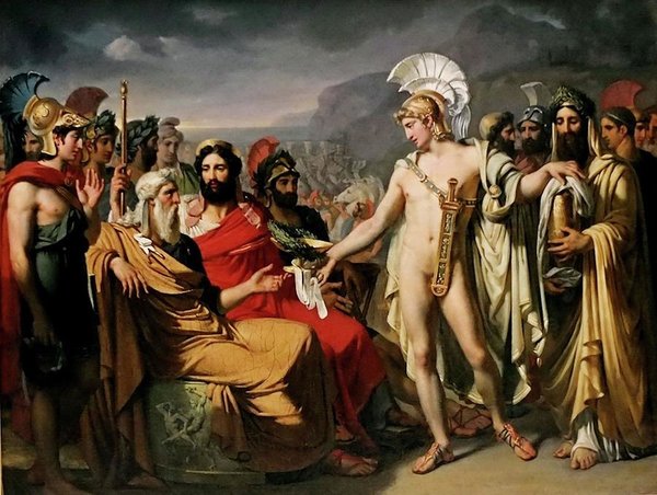
A potential scene from Homer's The Iliad, Achilles Pays to Nester the Price of Wisdom by Joseph Desire Court
This leads me back to your artwork, which characteristically affects the mind, body, and soul - otherwise known as visual poetry.
How do you do this - by way of composition or is it purely about color?
Shane Guffogg: Colors, for me, are emotions. I know that is a cliché thing to say, as it really goes into the realm of Van Gogh and Rothko, but, I will say it anyway because it is true. I have this strange ability to hear colors. I don't actually hear them like a song coming from the radio, but there is a silent, inner sound that I hear from colors. I always assumed everyone had the same experience but I know that is not true. Back to your question. Colors resonate with vibration and when opposite colors (from the color wheel) are put together, they bounce off of each other, like two magnets with the same polarity that won't stick together. As I am painting, there is a harmony of sounds that I am looking for. If I put an orange next to a green, depending on the shades of each, they dance with the eye, creating a movement. With the Still Point series, I can place different hues side by side and allow each line and color to be itself, as in, not referencing anything. A red line is just that, but the red against a blue pops off the canvas creating an illusionary space for the viewer to enter. When I make hundreds of these lines, each intertwining with the others, it creates an amazing visual symphony.
Guffogg's color palette for the painting below - notice the color blue. When you look closely at the painting in person, the blue is gradually dispersed within the layers
Shane Guffogg: "As I am painting, there is a harmony of sounds that I am looking for."
Continuing on, I want to describe further what I have witnessed from guests upon entering your studio. I watch and see that they sometimes feel a rush from the work in front of them. I want to let the reader know, this isn’t based on shock imagery but rather, a musical composition where it may be a color palette that feels like music, but literally there is no music playing.
What is the secret to your color theory?
Shane Guffogg: The secret is emotions; Tapping into by revealing and hiding colors. Sometimes the colors are so subtle they cannot be photographed but can only be seen when standing in front of the paintings. This requires the viewer to slow down and be present in that moment. My art is merely a vehicle to get the viewer to recognize themselves, and by that I mean, to become consciously aware of the moment.
Sometimes, I look at a painting and I hear an afternoon raga, or even a piece by Igor Stravinsky, like The Rite of Spring, which is quite avant-garde. Other paintings feel like a pastoral or even a symphonic piece by Beethoven!
Can you explain this?
Shane Guffogg: Stravinsky! Yes, he often smashed notes against each other causing a dissonant sound which can create a feeling of tension or uneasiness. Colors do the same thing, like complementary colors. The Indian Ragas are usually written in the Key of C and the notes all wind around that key, creating rhythms that flow in harmony with every other note. Again, color can do the same thing. Every so often I remove colors from my palette and just use various shades of grey. The colors are all in the same tonal range and are harmonious. When a lot of colors and movements are placed on the canvas, they work as a whole, like an orchestra, with different instruments all working together to fill in the space with sound. The painting titled, "Many Gods and Many Voices", is a great example of this.
Shane Guffogg, Many Gods and Many Voices, oil on canvas, 66 x 84" 2018
The premiere of Igor Stravinsky’s, The Rite of Spring (1913) at the Théâtre des Champs-Elysées, Paris proved to be one of the most scandalous productions of all time as a riot ensued by the audience protesting it's unconventional musical score and choreography.
Shane Guffogg, Carmina Luminis, 42 x 42", 2019
The working title was Rite of Spring because the artist created the work while listening to Stravinsky's composition - Spring 2019.
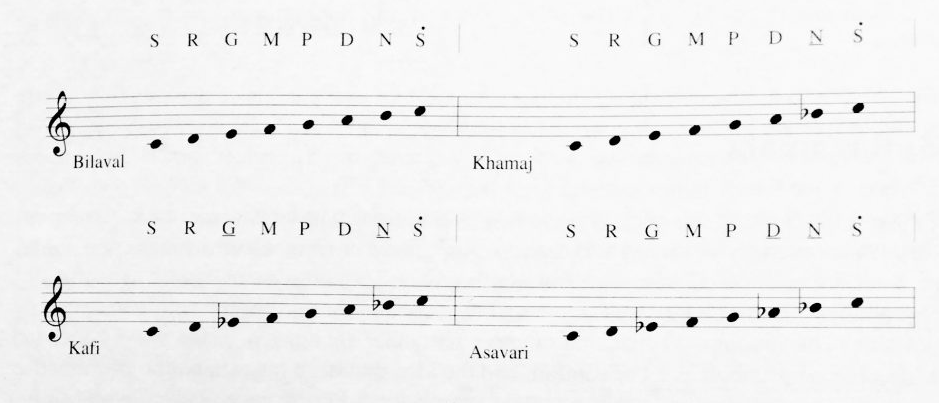
An example of Indian Music Theory - Notes have to bend, glide and slide into each other to convey the message and subtleties, this is very difficult to notate, so a lot of the music is learned naturally.
Shane Guffogg, I Remember, oil on canvas, 18 x 16", 2007
I want to shift the topic to a different perspective. If it were not for the transition of egg tempera to oil paint in the early 14th century, I doubt the artwork we see today, in particular, realism, would have been possible. For most of us, we take for granted what we see around us. Up until that time, the majority of paintings were created in egg tempera, which was flat-looking, as the paint dried quickly. Different colors had to be pre-mixed before painting and one could not add color to wet paint, rather, egg tempera paint was added in strokes, one on top of the other. Flesh tones were almost a singular color lacking the subtlety of shadow and light. Later, oil paint became popular which allowed the artist to create depth and true variation of color because they could work wet on wet paint. Your series, Sapere Aude (Dare to Know) is a wonderful example of the use of oil paint and how you introduced flesh tones to the abstract composition. It's quite interesting as you paint in a realist manner, defining the physical, and sometimes, what I think I am looking at are nude bodies that are intermingled. I don't understand that because your subject matter is abstraction - which to me is cerebral, as the subject is not necessarily informed by symbols to provide a reference. How did you arrive at this gateway?
Detail of The Wilton Diptych, Unknown artist, (1395-99), egg tempera on wood. Notice the flesh tones seem somewhat flat.
Shane Guffogg, Sapere Aude #7, oil on canvas, 84 x 60", 2018
Shane Guffogg: I have always loved Renaissance and Baroque painting. The Peter Paul Ruben nudes, with their translucent flesh, is of another world. Also Rembrandt's flesh tones, and of course, Carravagio. The way they painted flesh is so sexual and seductive. I am a sucker for that type of painting but I am equally taken by a great Kandinsky or Rothko. The question I started asking myself back in the 80s after finishing at Cal Arts was, is it possible to do both in one painting? It is the question that is the most important thing because without the question there is no answer. I also began thinking about my own body and how I move when I paint. Then I realized, my movement as it applies to painting the human form, was really what I was after. If my movement of the brush on a large canvas was an extension of my physicality, then it would be figurative by default as it would be an extension of or the result of my physical presence and movement. It took many years of refining to turn that movement into my own language, but that is what it's about. And yes, they are like nude bodies intertwined, or, I think a better way to say it would be shapes and lines that are being informed by bodies, flesh and the entanglement of people, both physically and emotionally.
Peter Paul Rubens, The Judgement of Paris, oil paint, 1636
"I have always loved Renaissance and Baroque painting. The Peter Paul Ruben nudes, with their translucent flesh, is of another world" - Shane Guffogg
Michelangelo Merisi da Caravaggio, Martha and Mary Magdalene, oil and tempera on canvas, 1598
(Detail), Rembrandt, Self-Portrait with Beret and Turned-Up Collar, oil on canvas, 33.2 x 26", 1659
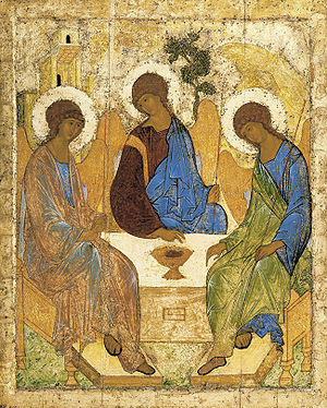
Still referencing egg tempera and Sienese painting with the use of gold or silver, I would like to talk about one of your most recent series, Time in Space and Space in Time. The paintings have a similar effect without the flatness of egg tempera – you used oil paint to create a dynamic spectrum of color and depth throughout the composition. Were you inspired by Sienese painting or Russian Icons?
Shane Guffogg: You have a keen eye. Yes, I have spent countless hours looking at the early religious paintings and the flatness of the images, but they are very stylized, which makes them about an ideology, instead of recreating an event. For me, the gold leaf they added, was like a shift between dimensions and consciousness – the use of gold is an object, a color, and a subject. It is flat and destroys the illusionary window. The gold juxtaposed against the painted image creates 2 realities – subjective and objective. That idea was what fed into the Space of Time paintings. The paintings twist and turn in on themselves, pushing and pulling on space as your eye follows the lines. I have a memory from my early childhood of looking at some wallpaper that was in my mother's bathroom. When I took a bath, I would stare at it. And when I stared long enough, the abstract shapes would become profiles of a woman's face. Kind of like the psychological test that Jasper Johns played with – the portrait of the young beautiful woman wearing a hat or the old woman that looks like a witch? It is that push and pull that I am interested in exploring in these paintings. And because they shift between foreground and background, I can use colors to inform the viewer about the inherent duality of space.
Russian Icon, Artist unknown, Our Lady of the Sign, tempera and gold leaf on wood panel
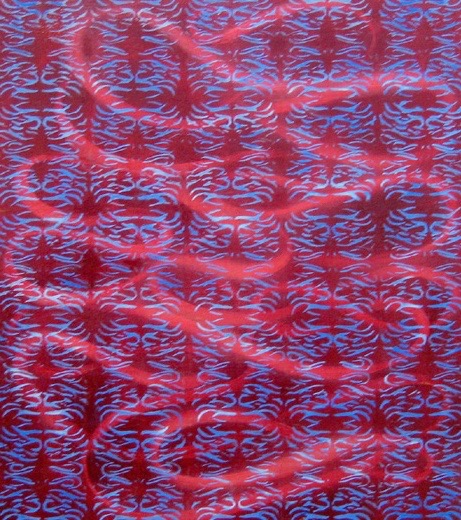
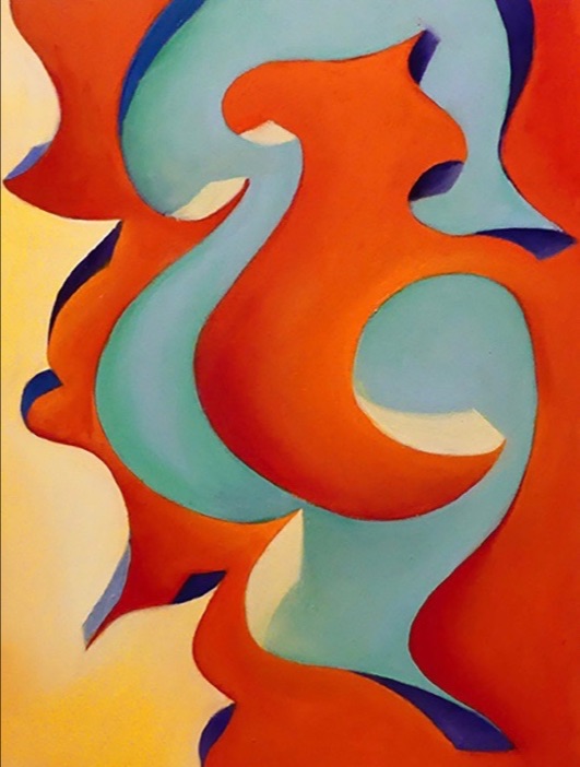
Shane Guffogg, The Time of Space and Space in Time #1, oil on wood, 12 x 9", 2017. My question to Guffogg: "Were you inspired by Sienese or Russian Icon paintings when you created this series?" (Guffogg has completed 11 paintings to date)
Shane Guffogg, The Time of Space and Space in Time #2, oil on wood, 12 x 9", 2017.
An early Russian Icon painting by Andrei Rubler, Holy Trinity, Hospitality of Abraham, tempera on panel, 1411
You have another thing in common with the painters of the 15th and 16th century - glazing. A great example of this can be seen in your early Untitled paintings were followed by the Pattern paintings, Ginerva de Benci and Odic series. In the later the glazes are extremely successful as the work is about energy sources unseen by the naked eye, only felt and psychically realized. The more I understand painting, your work feels like a Renaissance or Baroque painting but your subject matter is about current philosophical and scientific inquiries. Tell me more about why you chose to continue this tradition with glazing?
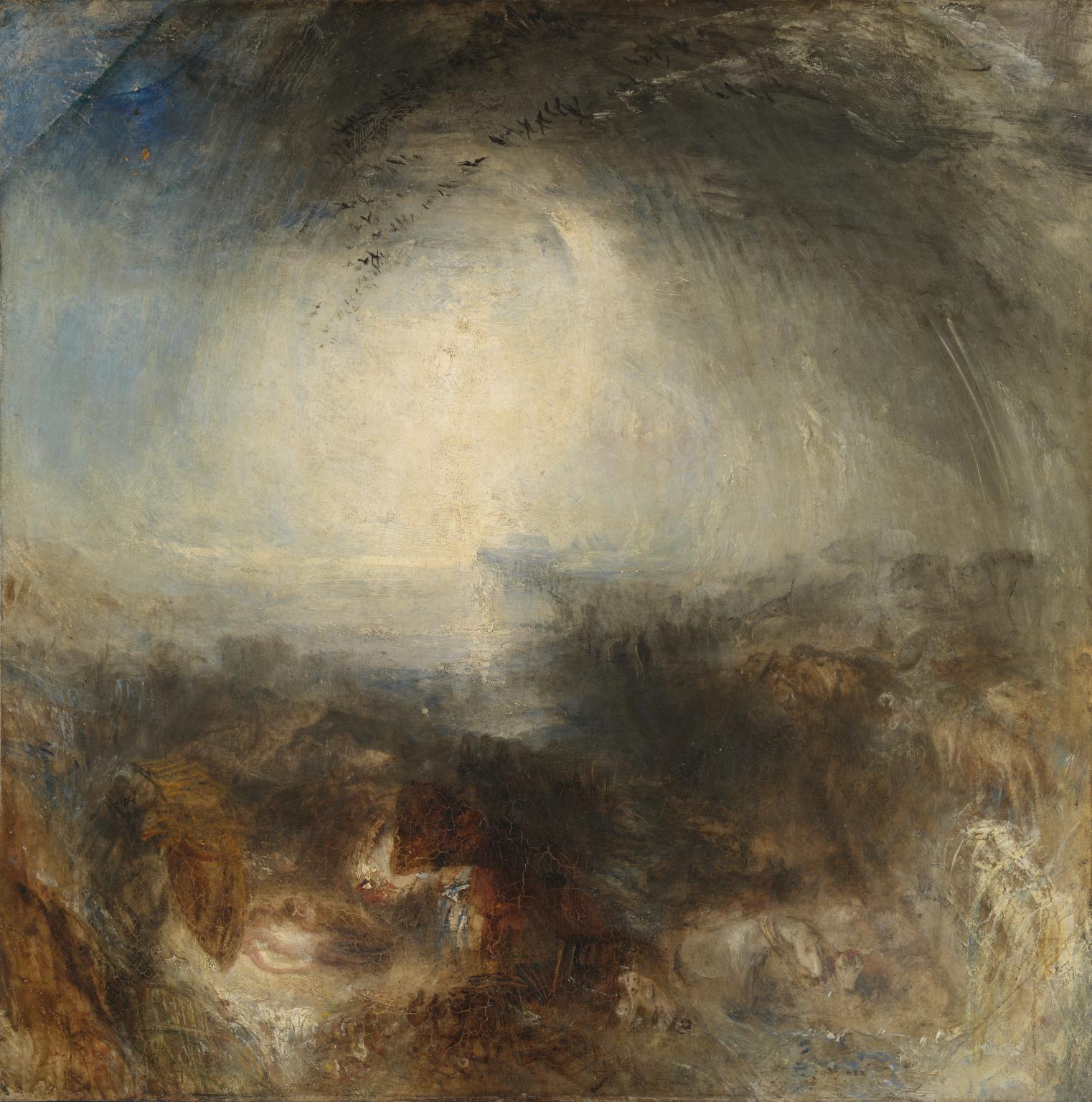
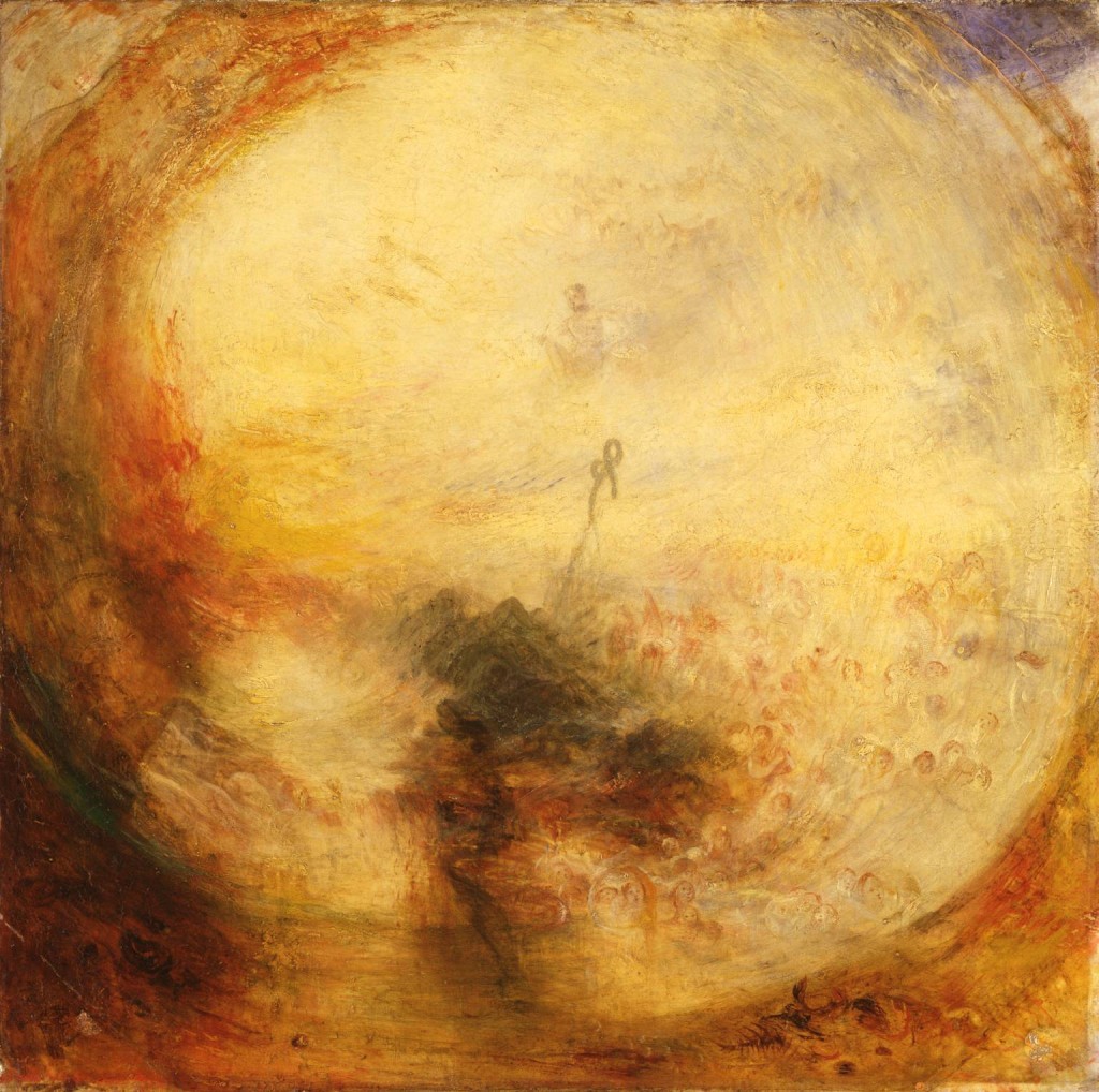
Shane Guffogg: I came upon the glazing technique after seeing the old masters in person and wanting to recreate those effects. I had a friend ask me once what the difference was between the way I paint and someone else who doesn't use glazes. I explained that if I were painting a mountain off in the distance, I would paint the mountain with the colors as if I was close by, and then add thin layers of light blue glazes over it. What this would do when I had 20 or more layers, is create a similar effect as looking through the atmosphere at a mountain. The color changes to a purple-blue. Basically, what I am doing is recreating through paint, the way we see our world. A Plein Air painter would mix the color they see the mountain to be and paint that directly on to the canvas, which is also beautiful. William Turner is another one! His use of glazes – creating those atmospheres – is amazing. And again, I ask myself, why not combine the figurative with the abstract and paint moments that would normally be abstract - like the marks of a brushstroke - and paint it as if it is real, floating in that renaissance window. Here is another thing, the glazing creates a space within the painting, and that space allows the viewer in. This is a much different experience than a painting with thick paint that sits on the surface, taking the painting into the realm of an object. Another amazing thing about glazing is that when my paintings are lit properly, light can penetrate into the surface of the glazes and reflect back out, creating a sensation as if the paintings have their own inner light source. Glazing for me is pure alchemy!
Joseph Mallord William Turner, Shade and Darkness - The Evening Before the Deluge, (pair to Light and Color (Geothe's theory), oil paint on canvas, 1843. The artist was known for his glazing techniques to create atmosphere and intrigue.
Joseph Mallord William Turner, Light, and Color (Goethe's Theory) - The Morning After the Deluge, (pair to Shade and Darkness), oil paint on canvas, 1843. "Through my research, I read that Turner cited Goethe's Theory, which talks about the "plus" and "minus" colors which inform our eyes as well as our emotions"
Shane Guffogg, Untitled #40, oil on canvas, 16 x 12", 1991
Guffogg's glazing techniques are borrowed from Renaissance and Baroque painting, (14th - 17th centuries), he says the use of glazes creates a space to invite the viewer in.
Shane Guffogg, Odic #9, oil on canvas, 80 x 60", 2018
The title, Odic, comes from Odic Force, an idea developed by Baron Carl von Reichenbach. It was based on his investigations of the human nervous system and how it could be affected by various substances. He conceived the existence of a new force allied to electricity, magnetism, and heat -- a force which he thought was radiated by most substances and could influence people that were highly sensitive. Proponents say that Odic force permeates all plants, animals, and humans. Believers in the Odic force say that it is visible in total darkness as colored auras surrounding living things, crystals, and magnets, but that viewing it requires hours first spent in total darkness, and only very sensitive people have the ability to see it.
Guffogg's composition in response to this theory (from my point of view) is quite fascinating because when viewing this work in person, it really feels like a magnet pulling the viewer in. The artists glazing techniques and his use of color and line may have something to do with this phenomena.


