Shane Guffogg: Color Part 2
(Conversation between , Victoria Chapman and Los Angeles based artist, Shane Guffogg continues)
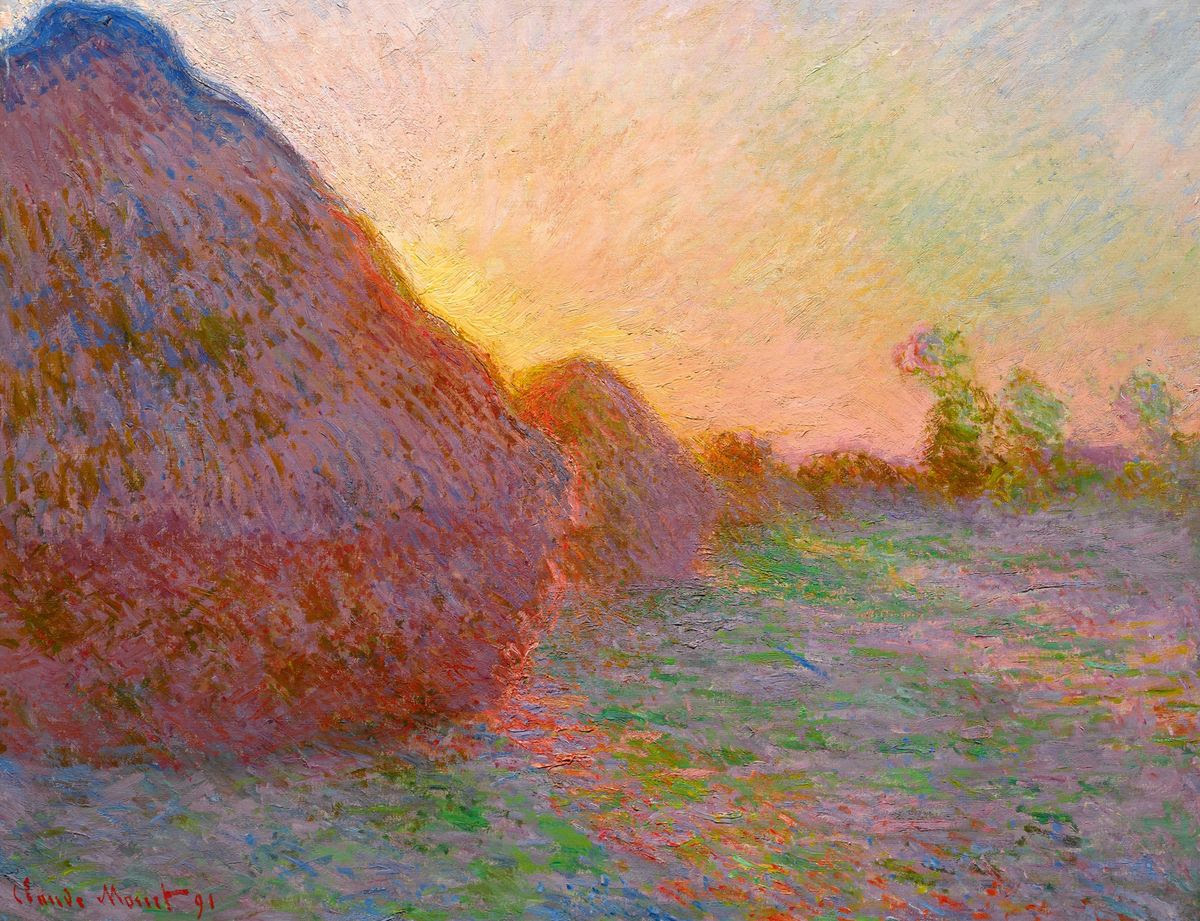
It's hard to believe before the 1800's artists were for the most part using color as an intrinsic property of an object. During the French Impressionist era, this changed, as artists began to use color and light to investigate emotion. Claude Monet's paintings of haystacks are a good example of this. Being present in the flutter of the modern world, it's unimaginable to think that what see today has not always been, but rather, it evolved with the passage of discovery. This is one reason why I enjoy de-coding the history of color on an organic and personal level. As I continue researching I found that it wasn't until the 1890's that color was used to define feeling, and light was its counterpart. I sparked up a conversation with Guffogg about my findings on the French Impressionist and he was quick to tell me that Monet painted these haystacks at different times of the day. This got me thinking more and I turned around to see one of the four paintings Guffogg painted in 1983, titled Flowers, where he used the object, light and passage of time to expel the feeling of a thriving bouquet to a stage of collapse. As we continued the conversation Guffogg had this to say:
Claude Monet, Meules (grain stacks or hay stacks), 1890
Shane Guffogg, Flowers #3, oil on canvas, 28 x 22″ 1983
SG: Monet's haystacks, the Rouen Cathedral series and of course the waterlilies, all are amazing works of art. The colors he chose are all about his ability to truly see. Most of us see with our minds and not our eyes. By that I mean we have a preconceived idea of what color something is. Monet saw the subtleties of color and saw amazing colors in shadows. His ability to accurately see and translate that into paint gives us the ability to see what is really there. When I stand in front of his greatest accomplishments, I am always struck with how he saw light and shadow and the colors he chose to communicate that moment. It is all about being present and in the moment. So in that sense, Monet's greatest works are a truly a state of mind that is based on perception.
Claude Monet, Water Lillies, 1916
That is a profound statement and very true. Guffogg will often extend some philosophical significance into his answers which is rarely spoken about in art theory. These types of replies fuel my curiosity into the meaning of life and art, which have only helped me to realize a key factor when viewing art – “If it does not move, teach or transcend me to another state - is it truly art or is it merely illustrating or documenting an idea?” In Guffogg’s early works dated around 1981 to 1983, the paintings seem to be a balancing act between realism and abstraction. The colors are expressive, and in some cases almost electric. The compositions explore key moments of personal discovery. His paintings still hold these key components, with an added gestalt of spirituality opposed to depicting reality. When Wassily Kandinsky first got his glimpse of Monet’s haystacks in 1896, his views on art changed. Apparently, Monet’s exhibition toured St. Petersburg, Russia and it had a deep effect on the way Kandinsky saw color.
The painting showed itself to me in all its fantasy and all its enchantment. Deep within me the first doubt arose about the importance of the object as a necessary element in a picture.”- Wassily Kandinsky
Shane Guffogg, Seated Nude (After Rembrandt) oil on canvas, 48 x 54″, 1982
Through continued research, I read that Kandinsky was one of the first to view color in a subjective manner referencing the “inner nature” sourcing emotional and sometimes spiritual components. Within the next fourteen years, an invasion of color took hold in art that included Fauvism (1905, meaning 'wild beast'), a term coined by the conservative art critique, Louis Vauxalles. This movement brought about a newcreative freedom in color and expressive language. By 1910 the first non-representational abstract painting was realized. Kandinsky’s analysis of color in “Concerning the Spiritual in Art” shaped a new frontier. I am realizing the impact color was having on art and ask Guffogg if Kandinsky's use of color or the book have any influence?
Henri Matisse, Woman with a Hat, 1903,
The Fauve movement brought about a new creative freedom in color and expressive language.
Henri Matisse, The Joy of Living, (Le Bonheur de Vivre), 1905 – 1906
Matisse's painting The Joy of Living revolutionized the art world and it became an instant sensation when exhibited in Paris
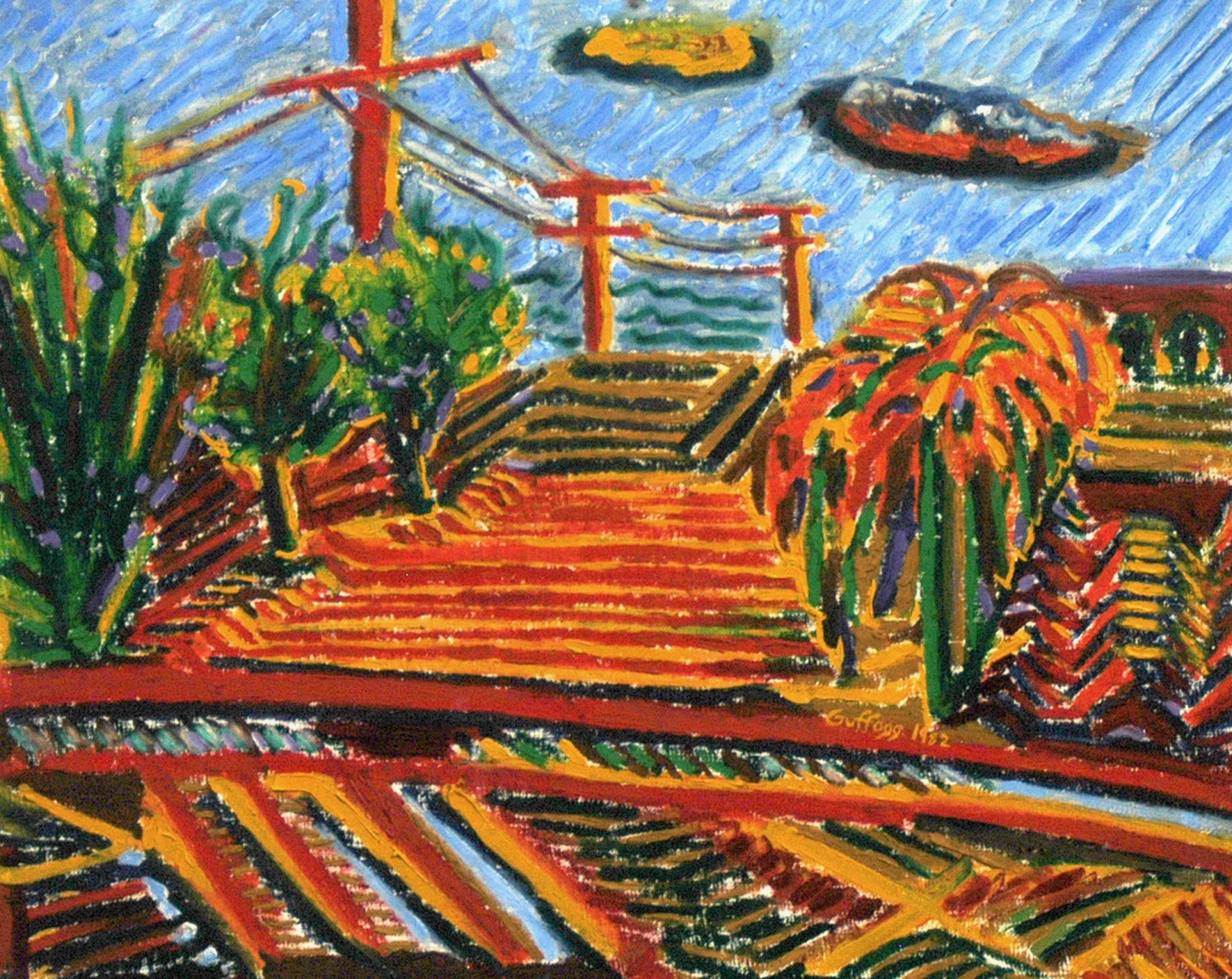
Shane Guffogg, Sierra Foot Hills Summer, oil on canvas, 1982
Guffogg was being influenced by the likes of Matisse and was seeing his surroundings through new eyes.
SG: As a teenager, my mind and sensibilities were not developed enough to fully comprehend the power of color. I was influenced by the old masters and their skill of capturing the likeness of a person, and in the hands of a master (like Rembrandt) transcending that likeness to speak to something that is more universal. I got my first exposure to Kandinsky when I was 18 and sitting in an art history class at the local junior college I was attending. I remember very clearly seeing Kandinsky's images projected on the screen in the auditorium and listening to the lecture that day. Kandinsky's work first shocked me followed by a headache and nausea and decided I really didn't like what he was doing with paint. His colors were representing something other than the objects or scenes he was painting. They were color for color's sake and for me it felt like a blunt object being hurled at me and was breaking my self-imposed bubble of naivete. His work stuck with me and I couldn't shake off the early blue rider paintings or his earliest abstract works. Never one to shy away from a confrontation, I went to the school library and checked out books on both. I came to understand that I had such an adverse reaction due to the obvious fact that I was having to think about my world in a different way. I would never look at color the same again and it set me on a new course.
Wassily Kandinsky, Improvisation 28, 1912
SG: I was like a sponge needing to absorb everything I could. I started to realize the freedom and sense of empowerment to truly express myself through color. This led me back to Van Gogh and his paintings and letters to his brother Theo and how he talked about wanting to use colors as if they were a couple in love, joined in marriage and become stronger from the union – he wanted colors to do the same. Even though I was living 100 years later, his desire to use colors as a vehicle of expressing his emotions all made perfect sense. I started borrowing from their styles and use of colors to see how it felt, like trying on a vintage sport coat at a thrift store. It felt good and empowering. Then, of course, I read Kandinsky's book “Concerning the Spiritual in Art” and that opened my mind to the concept of art as something that could be spiritual and help change the way we see, which is essentially a way of changing society, if however so small. Art had the power to affect people, and Kandinsky was hoping to use his art for the good of humanity.
I completely understand how Monet's haystack paintings had that effect on Kandinsky. When I saw Monet's waterlilies for the first time, I was speechless. The size of the long paintings, the colors and his use of oil paint, often straight from the tube, dabbed thickly onto the canvas. He built up layers of opaque paint, and for me, these layers were all moments of time. What we are seeing is a time lapse of color, as it appeared to Monet, throughout the hours and days of his observations. Colors have relationships with each other; they can dance, sleep, fight, argue, engage, caress or enhance when placed in the right vicinity with each other.
A few years back there was a Kandinsky exhibition at LACMA. It was a small show, maybe 15 paintings in all. But they packed a punch for me. I distinctly remember standing in front of a large mid-career abstract painting, and realized what I was witnessing was Kandinsky's thought process. Each color was being informed by the previous choice and brush stroke. On one corner was a large patch of a deep cadmium red, and I thought, without first looking, to balance this he needs a deep green on the opposite corner. I looked down and there it was. His colors create a balance through the conflict of placing complimentary colors within striking distance. And the fact that he was Russian makes even more sense. The Russian landscape in the winter has almost no color, coupled with the unrest that was constantly under foot that led up to the Bolshevik revolution, is there in those early works. They are profound moments captured in paint.
Wassily Wassilyevich Kandinsky (1886 – 1944), was a Russian painter and art theorist. It has been said that Kandinsky creating the first abstract painting
Wassily Kandinsky, Composition XII, 1913
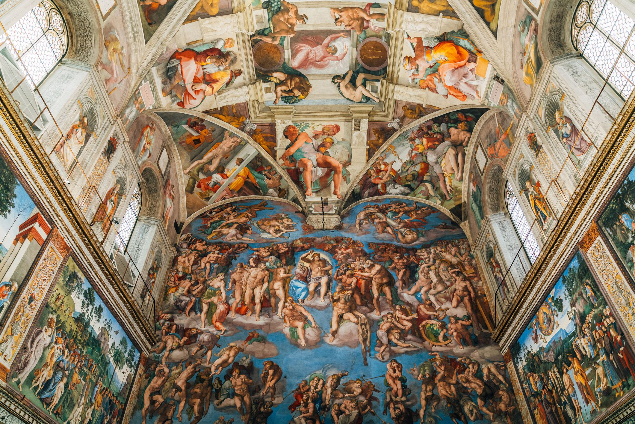
I am going to turn back the clock now. Leonardo da Vinci (1452-1519) perfected tonal unity in his paintings and he was also a master of drawing. Much earlier writers including Aristotle, supported the debate of drawing over painting, quoting “line conveys rationality and order; while color appeals to the senses.” Giorgio Vasari (1511-1574), who wrote “The Lives of Artists”, (1550–68), praised artists such as Michelangelo Buonarroti (1475–1564) for his “formal preparation of endless drawings.” The Florentine painters also were credited for their draftsmanship, which was in contrast to the work of Venetian painters, such as Titian, who often worked out their compositions on the canvas, giving undue importance to color. Michelangelo was later quoted saying of the Venetians, “Although their color and style are pleasing, it’s a shame the Venetians did not learn to draw well.” Vasari supported Michelangelo as being the undisputed master of drawing during the 16th century. But that was not the only thing he was known for – he was also a front-runner for using varying contrasts of color, or shot hues, described as shifting hues by combining colors to create mid-tones and light tones. Michelangelo’s use of vivid colors on the ceiling of the Sistine Chapel displays this. Now, look at Northern Europe's, Johannes Vermeer (1632 -1675), it’s debatable how many works have been attributed to him, (the count is 34) but his signature effect is the same use of blending color to create subtle effects of light. By the 1920’s Pablo Picasso and Fernand Leger similarly were engaging this color practice in their work. This leads me back to Guffogg's work and his series, Amor Fati.
Michelangelo, partial ceiling of Sistine Chapel, Rome
Titian, Venus of Urbino, 1538
When I look at your Amor Fati paintings I see something similar with this usage of red and yellow, where you apply opposites to create a striking contrast and an emotional pull. Friedrich Nietzsche's explanation of Amor Fati, describes an attitude in which one sees everything in one’s life, including suffering and loss, as good or at the very least necessary, to love one’s fate with all its decree of eternal recurrence. The power in these two colors (red and yellow) in your paintings is quite immersive. How were you able to visualize this composition, and come up with this color palette? I think this is very complex on many levels; drawing, the science of color and the spiritual effect.
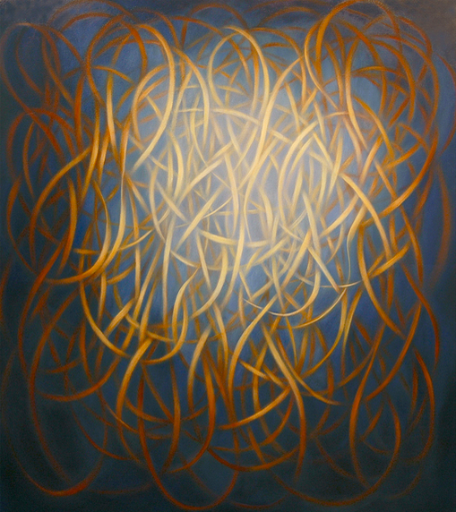
Shane Guffogg, Amor Fati #8, oil on canvas, 39.5 x 40.5", 2018
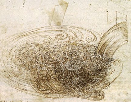
SG: Drawing versus painting is an interesting topic. Some painters draw with paint, some paint with paint. In Picasso's later synthetic cubist works, he drew with paint. In his blue period and Rose period, he painted with paint. Leonardo applied dozens of thin layers of glazes to achieve the subtle variations of light and colors. And he would often blend with his fingers! Even in Leonardo's day he was revered as a genius. When he first unveiled the Mona Lisa it sent shock waves through Florence because a painting had never existed that was so life like and seemingly real. Leonardo used paint to change the way we see, which in turn changed the way people thought about the world around them. His drawings and studies of nature – how water flows, how a bird can fly, the skeletal and muscle structure of the human body – allowed him to see what was behind the curtain, giving him an amazing insight to why things appear as they do. His paintings are that curtain (outer appearance) that we see. On a side note, just to put things in perspective, Michelangelo unveiled his statue of David the same year and city as the Mona Lisa. Two geniuses feeding off each other. Michelangelo was also an amazing drawer and his paintings, in my mind, are more sculptural and therefore, more drawn than painted. We know that preparatory drawings were done in his studio and small holes were punched along the drawn lines Then these drawings were placed on the ceiling of the Sistine Chapel and he would take crushed charcoal in a cheesecloth bag, and hit it along the lines so the charcoal dust would leave a little outline of the drawing through the punched holes. Then colors via pigments were added to the wet plaster, which he would apply to the area he had just marked out. The colors of the fresco technique are more direct than oil painting and is akin to stain glass. But it had to be to have an impact when being viewed from such a distance. The subtleties and details of Leonardo's oil painting technique would have been lost on the Sistine ceiling.
Drawing of "Water" by Leonardo da Vinci
Drawing by Leonardo da Vinci
Conte drawing by Michelangelo
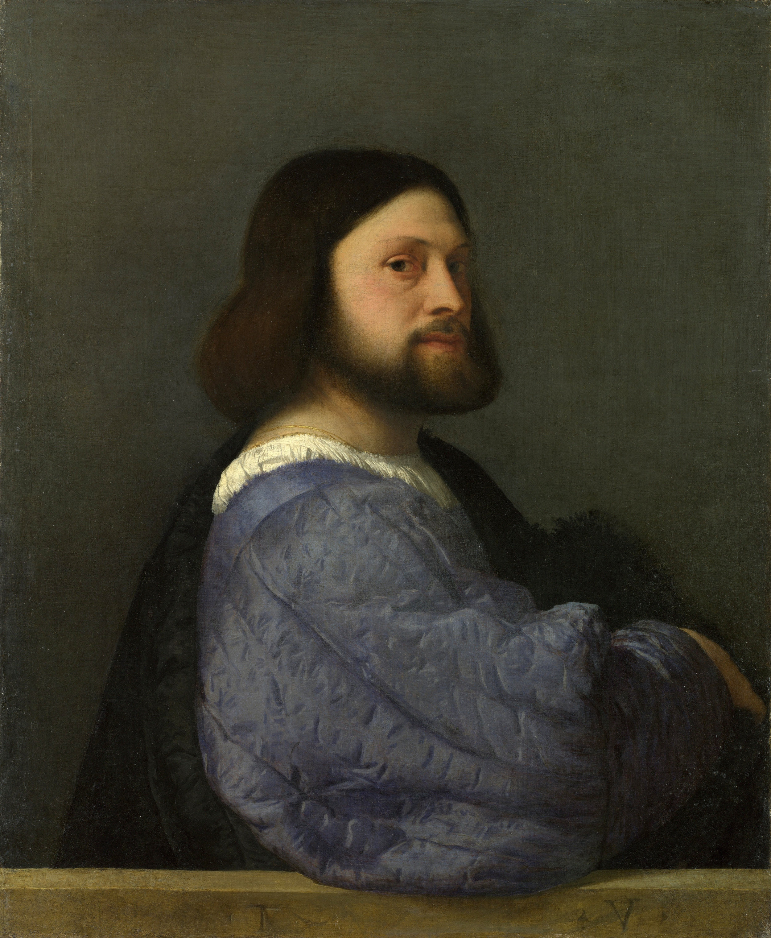
SG: The Venetian painters, like Titian, are very much about painting and the blending of colors to create an atmosphere of light and color. But, it makes sense this would be the way they wanted to paint because the light is so diffused from reflections off the water of the canals. Titian's subjects are placed within the space he creates. The same is true with Leonardo, but Titian's paintings are more realistic whereas Leonardo's are idealized, meant to convey a message rather than portray a person. By the way, Rembrandt's favorite painter was Titian, and you can see the influence of his use of light in Rembrandt's work.
Rembrandt, Self-Portrait, oil on canvas, 40 x 31", 1640
Titian, Portrait of a Man with Quilted Sleeve, oil on canvas, 31 x 25.9", 1509
SG: Vermeer – that is a whole other ball game. There is a great documentary on how he potentially made his paintings using a reflective lens to project the image onto his painting surface. But his blending of colors, like the Italian Renaissance masters, is about observation. Those subtle shifts between the red dress of the woman drinking wine and the green of the man's shirt in is likelooking at a stemmed rose – the values of the colors find a perfect balance. That is what nature does and that is what great painters do – they find the balance of colors and composition. Vermeer's paintings are a snapshot of a moment in time. They tell a story, but it is a quiet story that allows us in to his world. The colors are rich and inviting. The patterns of the floor tiles juxtaposed by the stained glass window panes and the way the light washes across the wall – they are truly amazing works of art, and are about his observations of light, form and color. In Florence, the works are about an idea that is reinforced by observation. The colors of Florence are deep and rich in hues of blues, greens and oranges, which makes sense since it gets more sun than northern Europe. Our environment, the weather and days of sun versus rain, effect the way we see and think about color.
Johannes Vermeer, The Wine Glass, oil paint on canvas, 1660
SG: In my Amor Fati series, red is the main color. But within red are many shades that can create a deep space or expand outward. For instance, a cadmium red deep (for me), creates a receding space whereas cadmium red light creates a red that comes out from the canvas. When I put these 2 reds next to each other, I can create a push/pull that is subtle and creates a vibration that can be seen when the viewer stands there for a moment. Then when I add a cadmium yellow, that color also fluctuates between coming out towards the viewer or receding back into the picture plane. When these colors are blended through the glazes, one layer over another, it creates a subtle sensation of movement that is very real but presented as an abstraction.
Also, cadmium red is often used in portraiture to show light coming through a thin area of flesh, like a nostril. In Georges de Latour's painting, St. Joseph the Carpenter (which hangs at the Louvre), the boy holds his left hand in front of a candle and we see the light between his fingers – the trick is cadmium red light. It creates an illusion of light and simultaneously, something physical. I employ that color to do the same thing in the Amor Fati paintings, giving the ribbonesque brushstrokes the quality of flesh, especially when I mix it with a warm Naples yellow. This alluding to flesh is indeed my Amor fati – my life as it weaves in and around itself, crossing over one moment and disappearing into the next. That moment it disappears into, is that deep cadmium red which creates a moment of infinity within the painting.
Georges de La Tour, Joseph the Carpenter, oil on canvas, 1645
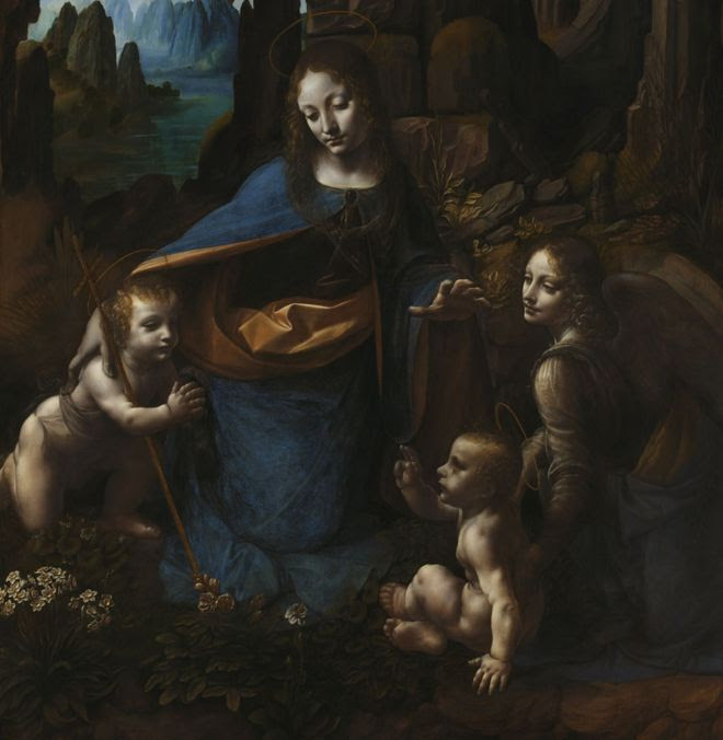
I want to continue to talk a little more about Leonardo da Vinci and how he refined color. We already touched on his achievements with tonal unity, where one color graces across the pictorial plane. I would like to add that da Vinci came to this during a time of massive scientific and technological discoveries, with all this excitement he could have gotten carried away with more saturated color like his contemporaries, but instead, he chose to go inward to challenge the intellect. To me, da Vinci was a genius, as he created a deeper understanding of naturalism through his use Chiaroscuro, where light colors comes out of dark colors with varying degree of distinction. I found this quote by da Vinci:
“I would remind you O Painter! To dress your figures in the lightest colors, they will be too slight relief and inconspicuous from a distance. And this is because the shadows of all objects are dark. And if you make a dress dark there is little variety between the lights and shadows, while in light colors there will be greater variety” – Leonardo da Vinci
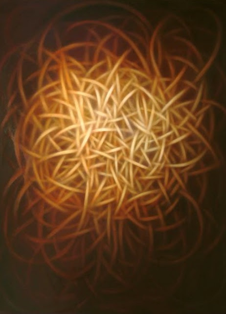
Your Ginevra de Benci series seems to me to share the same Chiaroscuro effect, the ribbons are moreover one tonal color amongst a darker background of varying degrees. I understand you were inspired by da Vinci’s portrait of the same title and what you were doing was taking it to the next dimension through the passage of the abstract pictorial plane, which for me enters a different way of understanding color via our consciousness. Some people think abstract art is quite simple to create, but it is so much more than that. Can you explain some of this and am I correct in thinking you created Chiaroscuro in your series as well and how did you take da Vinci’s portrait and translate it into an abstract painting?
Shane Guffogg, Ginevra di Benci #50, oil on canvas, 70 x 60", 2012
Leonardo da Vinci, Virgin of the Rocks, 1483
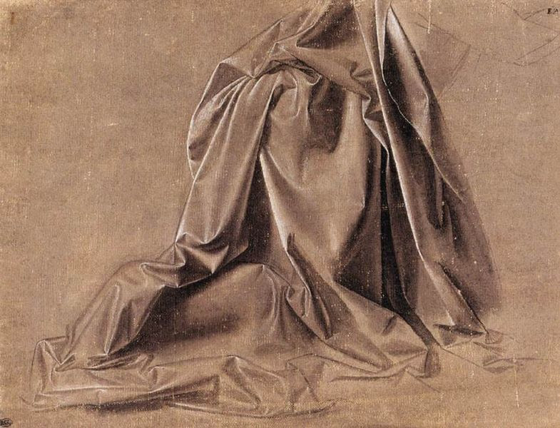
SG: Light coming out from the darkness creates a great sense of space within the picture plane and yes, I use that technique to guide the viewer into the experience I want them to have from viewing the painting. All of my favorite old master painters used that technique. It is very seductive, because as a viewer, you want to see what lies within that dark space. And Leonardo was right, of course. His chalk drawings (studies) of cloth are just amazing. Just by having highlights and a few recessed areas, he is able to show us the person’s legs and lower torso that is underneath the cloth. It is a grand illusion! Caravaggio is another artist who was a master at Chiaroscuro and he pushed it to an extreme.
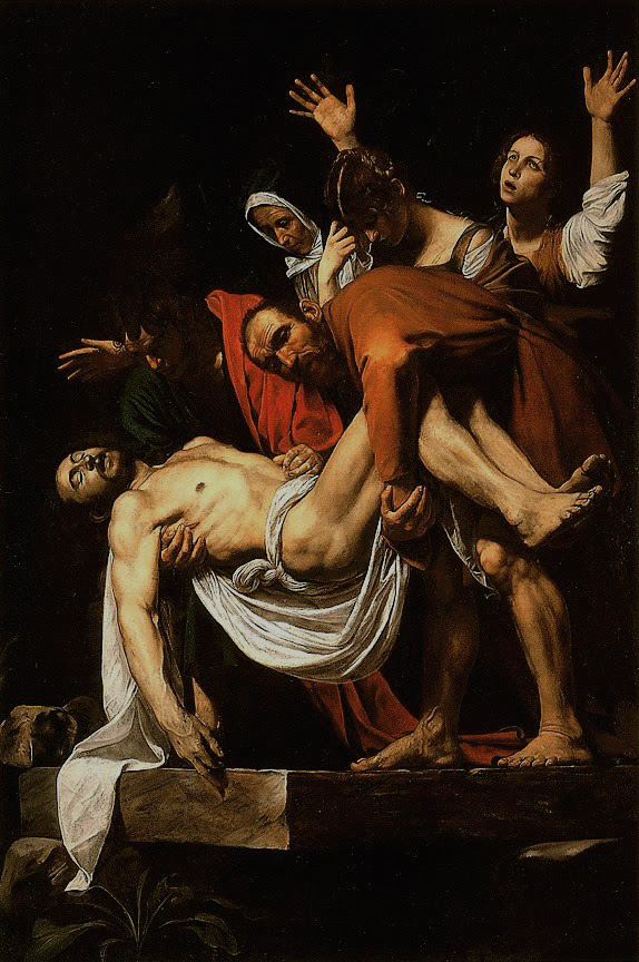
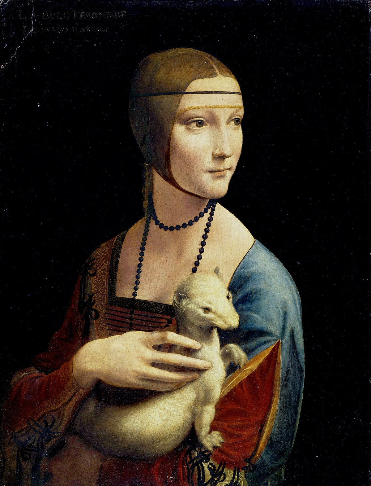
Take for example, The Entombment of Christ by Caravaggio. There are 5 figures, 2 men and 3 women. I am going to make a guess that they represented the 5 senses with the body of Christ making up the 6th sense. But I digress. The two men are holding the now dead body with the 3 women behind them. They look as if they have just stepped out of the darkness and into the light. A visual metaphor for spirituality? Probably. And look at the colors of the clothing – the man on the left is wearing an olive green shirt and has a cadmium light red cloak draped over his shoulder. Those are complimentarycolors and the other man is wearing a shirt that is a burnt orange color, which is half way between the green and red on the color wheel chart. The colors are framed by black and white and they are positioned to guide our eye around the picture, back into the darkness and out into the light. I was using that same idea for the Ginevra de Benci series, which also became the starting point for the Still Point series. For the Ginevra series, I used the lines that Leonardo used to create the contour of her face or her hair, etc. Look At Leonardo's painting title “Lady with an Ermine.” Her dress has 3 colors – Blue, Yellow and Red. The 3 primary colors all side by side. Then look at her right side (our left) and the neck line of her dress. It has a green border, and that border doesn't continue on past the head of the Ermine. It is as if she is wearing 2 different outfits. Or maybe he is showing us she has 2 sides, one is personal and veiled by the shadow and one that is public, which I think is represented by the vulva shape in her sleeve. Her hand is bigger than her face, which is not how hands are and I read some time ago that the sitter's lover commissioned the painting and Leonardo represented him with the Ermine, who is painted like a muscular man. She is facing away from us, the viewer, and is instead looking directly at the light source that is illuminating her. Lots of symbolism in this painting but it is the Chiaroscuro and the way he used colors that makes this painting so powerful but yet contemplative.
You can see in my Ginevra de Benci paintings, the chiaroscuro and modeling of colors are what makes the lines look organic, flesh like, which is very similar to Caravaggio's visual dialogue with light. As I was painting that series, his work kept flashing in my mind.
Art history is awash with colors that inform and guide our inner world through the eyes of the artists.
Stay tuned for Part 3 - Victoria Chapman
Caravaggio, The Entombment of Christ, oil on canvas, 120 x 80", 1603 - 1604
Shane Guffogg, Ginevra di Benci #13, oil on canvas, 30 x 24", 2011
The use of "chiaroscuro" in the work of Leonardo da Vinci
Shane Guffogg, Ginevra di Benci #17, oil on canvas, 80 x 60", 2011
Leonardo da Vinci, Lady with Ermine, oil on wood panel, 21 x 15", 1489 - 1490
