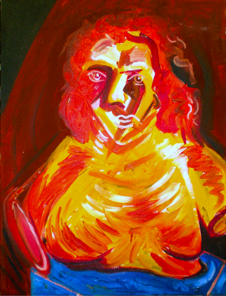
Shane Guffogg: Color Part 4
The beginning of the twentieth century
(Conversation between Victoria Chapman and Los Angeles based artist, Shane Guffogg continues
As we continue with the discussion on color, in part 4, we look at color opening new possibilities at the beginning of the 20h century. During the early 1900s, Pablo Picasso and Henri Matisse were known to be rivals. Matisse was leading the charge of Fauvism, the term that translates to “wild beasts” and represents the movement’s vibrant usage of strong color. During this time, Picasso had abandoned the Blue period, launching himself into a new palette, coined the Rose period, only to be followed by yet another shift in his work, due in part, to Matisse. Henri Matisse received a lot of attention for the paintings he was creating – some of the criticism scathing, some not. Picasso had his own reaction, as he began to create works that simply lacked color. But there is much more to this story and I asked Shane Guffogg his thoughts on these two giants of the 20th-century art world. The artist shares his ideas on the subject while revealing what influences his choice of colors. Guffogg’s answers are insightful, revealing yet another layer about his own work.
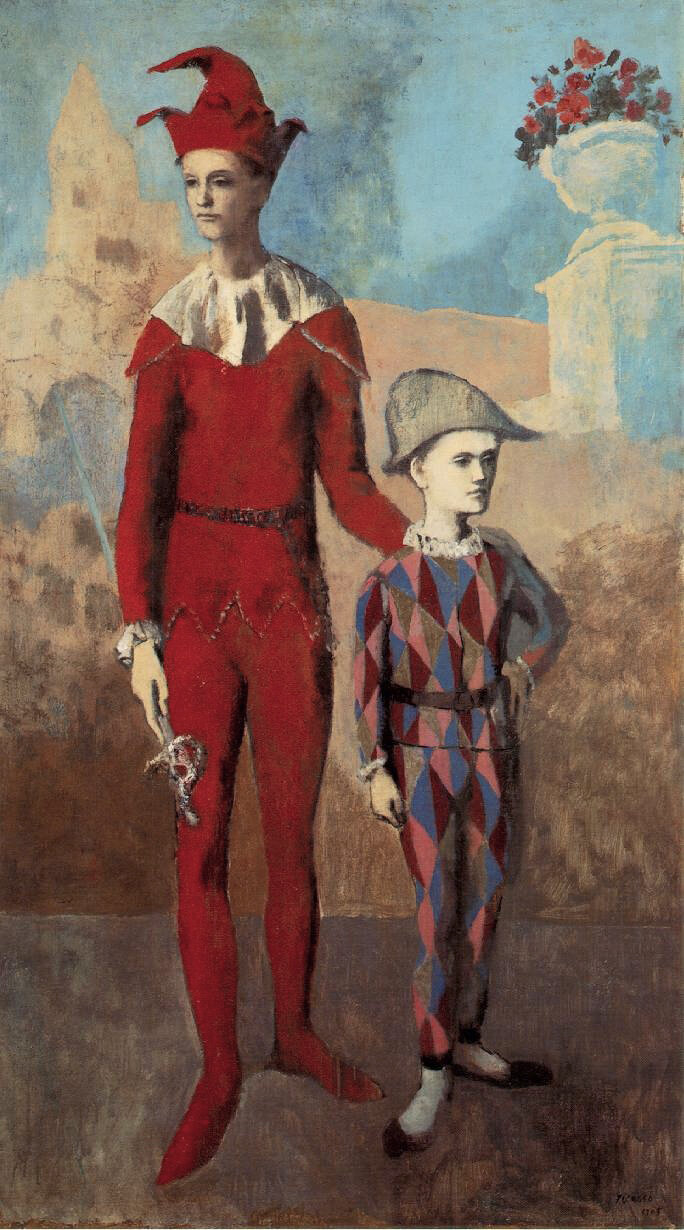
VC: Pablo Picasso once said, “Colors like features, follow the changes of the emotions.” As we continue exploring color, it’s important to touch on why a body of work may come into fruition. Change has many factors; it could be social, cultural or an artist may be influenced by an event or someone. Picasso’s Rose Period is an interesting subject. During this stretch of time, his paintings transitioned from dark to light. Family of Acrobats with Monkey (1904 – 1906), and, Acrobat and Young Harlequin (1905) are great examples. His placement of models shifted as well – there were intimate interiors scenes and landscapes with circus performers. What is your opinion about this and what or who do you think influenced him?
Pablo Picasso, Family of Acrobats with Monkey
watercolor, gouache, ink, pastel on cardboard, 40 x 29.5″, 1905
iHenri Matisse, Woman with a Hat
oil on canvas, 31 3/4 x 23 1/2, 1905
Pablo Picasso, Acrobat, and Young Harlequin
oil on canvas, 67 x 42.5″ 1905
Shane Guffogg: I see the rose period paintings as surrealist works more than anything. The circus or carnival people that occupy his canvases are displaced as if plucked out of the circus setting and placed in a barren landscape. Those people, in their real lives, travel from town to town, with no real place to call home. His portrayal of these people are symbolic of disassociation from any reality and seem alienated from society. They are characters in his newly made-up imaginary world. The softer pastel colors that Picasso used speak to the daydream-like state he was capturing. This new palette was almost the opposite of the Blue Period with the thick dark blues. His Rose series are thin washes of color, which for me, hints to the fact it is an imaginary world versus the weighty world of his Parisian life.
Pablo Picasso, Family of Saltimbanques
oil on canvas, 80 3/4 x 90 3/8″, 1905
V.C: I understand Picasso and Matisse were rivals and this began in the early 1900s while both were living in Paris, which was then the center of the art world. I read American art collectors (and brother and sister duo), Leo and Gertrude Stein were buying the works of these young artists and displaying them in their home. The Steins also would have dinner parties and Sunday brunches, inviting writers such as Hemingway and other intellectuals. I would imagine this is where Picasso and Matisse first met. Shane, I know you read a lot about art history, what can you share with me?
Shane Guffogg: I was recently reading a book about the artist’s rivalries and the chapter on Matisse and Picasso was so interesting. Matisse was in his 30s and Picasso in his early 20s when they met. Matisse was a scholarly gentleman who could speak about art history in length and could capture the attention of all the guests at Gertrude Stein’s dinner parties. Picasso was struggling with the French language, he was short, and did not have the wisdom or ability to command the attention that Matisse possessed. The Steins became huge fans of Matisse’s breakthrough paintings like Le Bonheur de Vivre and began collecting them and throwing dinner parties for all their favorite artists, writers, and intellectuals to marvel over their latest acquisitions. That is where Picasso first saw Matisse’s work and where they were introduced. It spurred Picasso on to push beyond his comfort zone and in a short span of time, broke all the rules that Matisse had previously broken and rewrote. Picasso found a way around the intense colors of Matisse. He took out color and reduced his palette to brown, grey and black; and instead of the figurative curves of Matisse’s nudes, Picasso dissected his pictorial space with sharp, jagged, and repetitive lines that flattened out and reconfigured our concepts of space and time.
Henri Matisse, 1913
Henri Matisse, Le Bonheur de Vivre
oil on canvas, 69.5 x 94.75″, 1905 – 1906
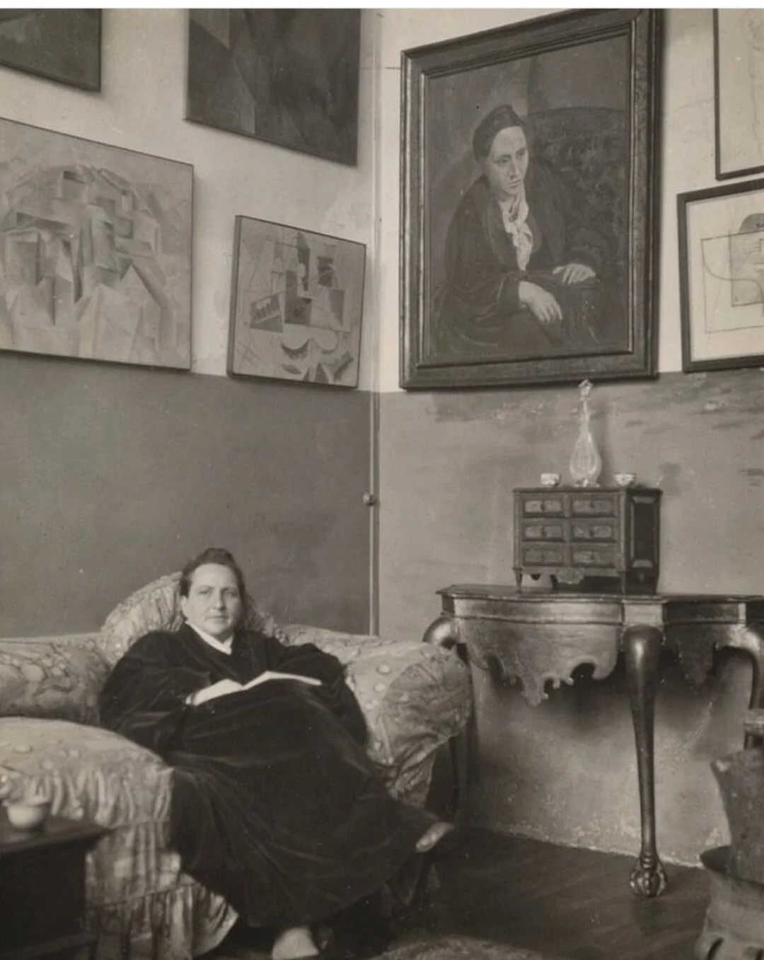
(Detail) Pablo Picasso, Portrait of Gertrude Stein
oil on canvas, 39 x 32″, 1905-1906
Gertrude Stein in Paris with her portrait by Pablo Picasso on the wall
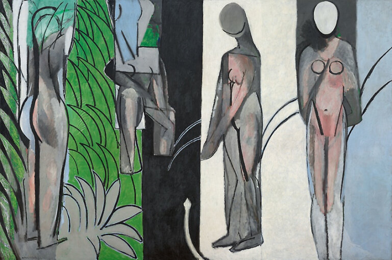
Shane Guffogg: I wonder if Picasso would have been content with his Rose Period paintings had Matisse not shown up? But Matisse was also full of self-doubt and watched what Picasso was doing. Back in 2003, I saw a great exhibition at the Museum of Modern Art in New York that looked at the influence that Matisse and Picasso had on each other. When Picasso broke away from the Western influences of perspective painting, Matisse tried his hand at cubism with works like Bathers by the River. When Matisse went to Morocco and was influenced by the saturation of colors that led to his use of intense blues, red, orange and greens, Picasso followed. And then Matisse would break away in another direction, stripping away color and reducing his images to simple line drawings and Picasso followed. It was a symbiotic relationship that existed throughout their lives and color was one of the main threads that connected them and propelled their work forward. I had the opportunity to see Matisse’s Harmony in Red (1908) at the Hermitage museum in St. Petersburg. First, I was struck by how big the painting is. Second, the intensity of the reds and the way he used the color as negative space for the blue patterns to dance within, throwing these complimentary colors together like that, create a rhythmic dance for the eyes. I can only imagine the impact of seeing this painting would have had at that time.
Henri Matisse, Bathers by the River
oil on canvas, 102 x 154″, 1909 – 1917
Shane Guffogg: And then look at what Picasso was doing that same year. Take for example Three Women, where he is trying to break free of his 19th century way of seeing but still using the female form, but now painted in rich oranges with highlights in yellow ochre and the shadows and outlines painted with burnt sienna. Picasso’s painting is filled with earth tones, but his imagery is about dissecting reality into prisms. Matisse was influenced by the patterns of the eastern Islamic world, which freed him up to focus on color. But then these patterns that Matisse was playing with found their way into Picasso’s mid-career works like Girl Before a Mirror from 1932. This painting is, in my opinion, a brilliant work of art. The colors are trying to burst through the patterns, all being contained by black outlines as if it were a stain glass window.
Pablo Picasso, Three Women
oil on canvas, 78 x 70″, 1908
Pablo Picasso, Girl Before a Mirror
oil on canvas, 64 x 51 1/4″ 1932
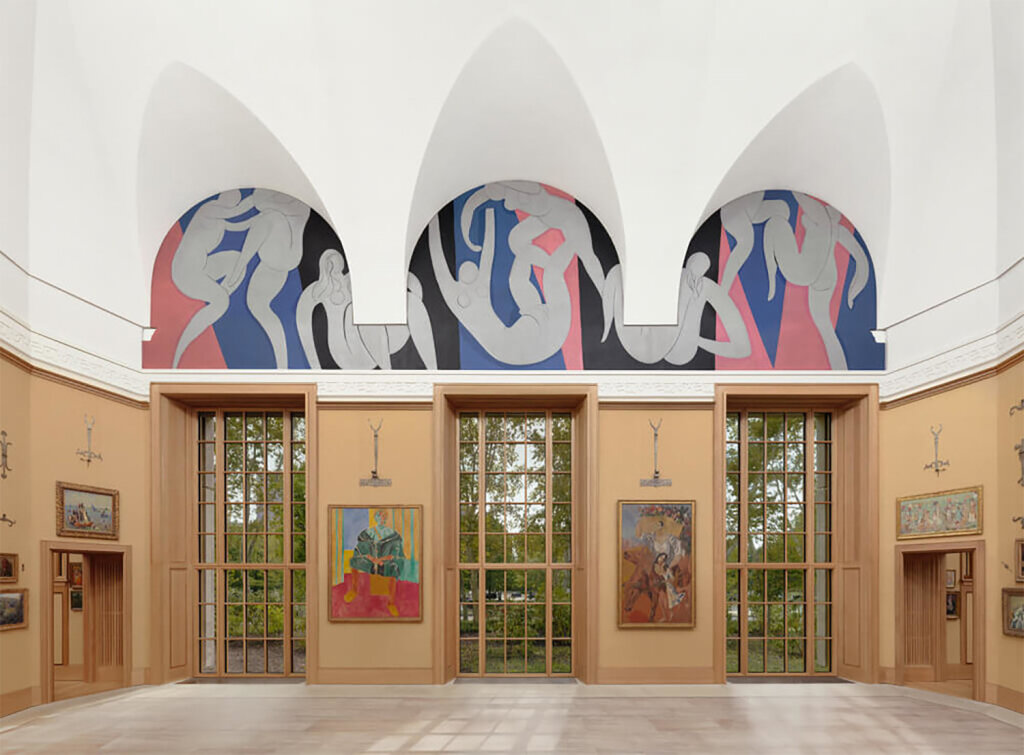
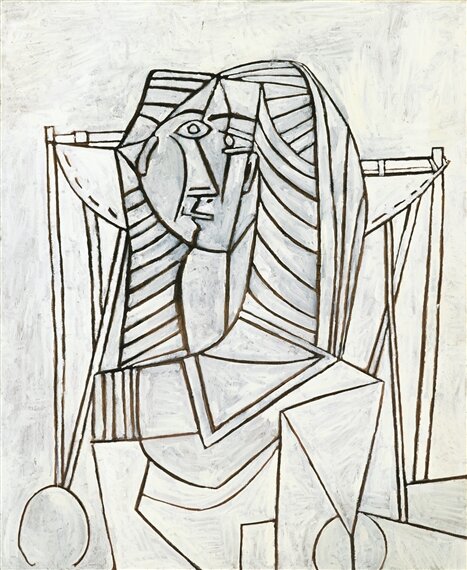
Shane Guffogg: Now, look at what Matisse was doing at that same time. His painting titled, The Dance, is also using the female form but he has now removed all traces of patterns and has simplified his palette to cobalt blue, pink, black and white. All four colors being opposites of each other with the two colors, blue and pink, representing male and female. These colors create a space for the dancing female shapes, which are simplified with mere lines, to move through. We can see the beginnings of Matisse’s final cut-out works in these paintings, where he painted on paper and cut out shapes. Matisse was bedridden towards the end of his life and unable to stand and paint, so he found a solution with paper. Picasso, around the same time (the early 1950s) was also simplifying his canvases. Gone are the eastern-influenced patterns and African influenced mask-like angular facial features. Now, like in the painting Femme Assise from 1953, he has simplified his lines and use of colors. There is a purity in both artists’ later works that can only be reached from years of investigation into color and form. And this newfound purity of color can be seen in the American Abstract movement of the 1940s and 1950s.
Henri Matisse, The Dance
Barnes Collection Philadelphia
Pablo Picasso, Femme Assise
oil on canvas, 39 x 31″, 1953
VC: You seem to know a lot about the influence of the Middle Eastern patterns and designs did it also find its way to your work?
Shane Guffogg: I was drawn to the patterns of the middle east architecture as a teenager, which led me to investigate the cultures more, leading to the Persian rug designs and art. I will tell you an interesting story. It was probably 20 or more years ago, I was in NY and I think I got dehydrated on the plane, which led to a headache. Regardless, I was determined to go to the Metropolitan Museum. As I walked through the art of the western world, my headache got worse and by the time I was at the French Impressionist section, my head was throbbing. So, I ducked into the Middle Eastern section to get away from the crowds. But a strange thing happened – the patterns of the art and manuscripts from the Qur’an, made my headache go away. I can only think it was due to the order of the designs and my brain was able to sync up with them. Of course, after that, I really started delving into the art of the Middle East and that led to sacred geometry, which then made me see the world around me in a new way. I began wondering about my patterns from my daily life and what they might look like, which led to the Cannac Series and also the two paintings titled Yaxche. I ended up exploring this idea for nine years!
Shane Guffogg, Cannac #3
oil on canvas, 96 x 78″ 2002
Manuscript of the Five Sections of the Qur’an
Shane Guffogg, Yaxche #2
oil on canvas, 74 x 52″, 2000-2001
VC: Didn’t you do a painting titled, Standing Before the Mirror? What was that about, was it a self-portrait?
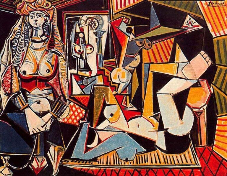
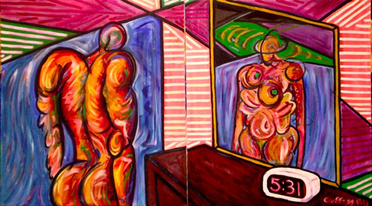
Shane Guffogg: I did and with that painting, I was looking a lot at Picasso and Matisse, which I think is evident with how I painted the walls in that painting. It was almost a direct quote from Picasso’s Women of Algiers. My painting is a strange creature because we see the back of a man who is standing in front of a mirror, but the reflection is that of a woman. It is painted on two canvases, but the lines of the nightstand and the painted wall don’t quite match up, as if we are looking at 2 versions of the same picture but in the form of a parallel universe. And the pink and blue, representing the male and female, was lifted off the Matisse I mentioned earlier. I was consumed in 1983 (the year that painting was done) with learning from the masters of the 20th century. The best way I could think to do it was to try walking in their shoes, so to speak.
Pablo Picasso, Woman of Algiers (Les Femmes d’Alger)
oil on canvas, 45 x 57.6″, 1955
Shane Guffogg, Standing Before the Mirror, (triptych)
oil on canvas, 42 x 40″, 1983
Shane Guffogg: Ah, good question. One thing that always strikes me about seeing a work of art that I am so familiar with via books is the size. That painting is much bigger than I imagined and that made the reds so much more confrontational. When I returned from Russia, I immediately started in on a new Amor Fati painting that ended up as the 6th in the series and the biggest to date. The movements within that panting are much different than the paintings before seeing Harmony in Red, and for me, it is not so much being influenced by another artist’s work as a being given a license to push your own limits and ideas to the next level. When I was standing in front of that painting, my mind began having a quiet conversation with Matisse, and the conversation was something to the effect of, “You made this in 1908! Wow, that took a lot of courage. You destroyed the Renaissance window of illusion and made art that is speaking in a new language.” If you can do that, then I now have the permission, for myself that Matisse granted me 112 years ago, to take chances in what and how I paint.
Henri Matisse, The Dessert, Harmony in Red,
oil on canvas, 60 x 84″, 1908
Shane Guffogg, Amor Fati #6
oil on canvas, 78 x 96″, 2016
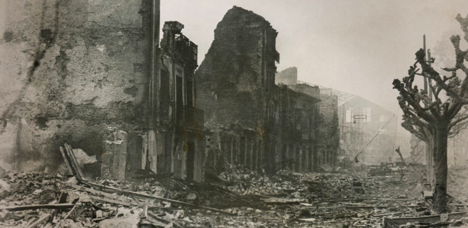
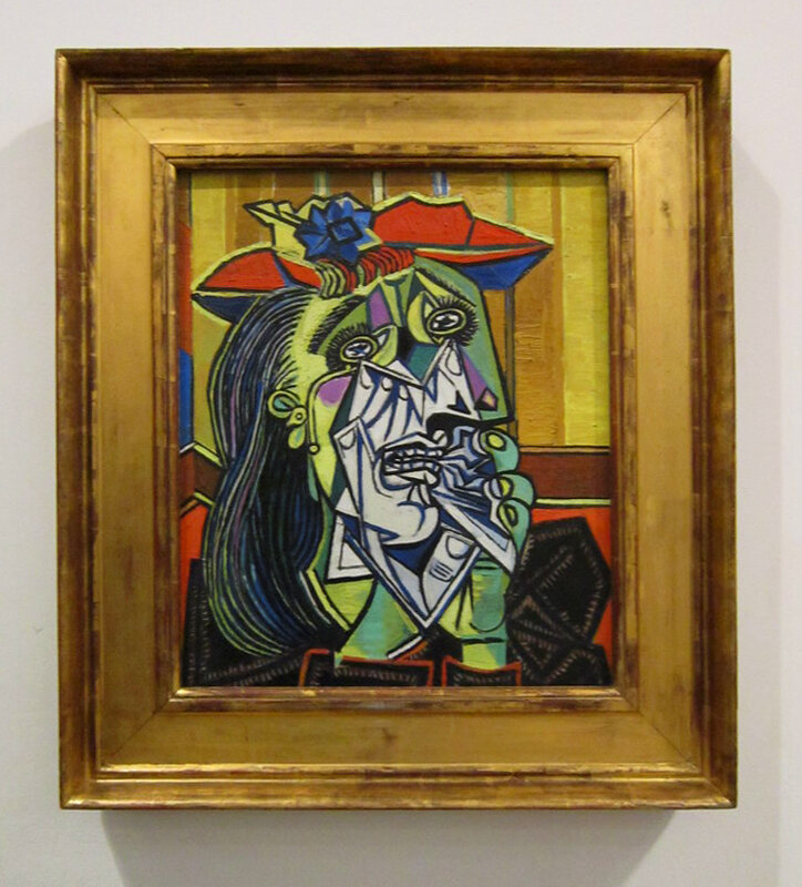
VC: Let’s jump from 1908 to 1937 and talk about the lack of color that can exist in a work, such as is Picasso’s Guernica (1937) consisting mostly of white, black and blue. During 1937 Picasso continued to make other protest paintings, which included the Weeping Woman series. In contrast to Guernica, this series demonstrated lots of color. Why Picasso chose to use color or not is an interesting topic. The painting, Weeping Woman (1937) and much of the series, revisits the portrait. I read that Picasso’s mother wrote to him from Barcelona about the smoke and fighting in the burning city, which made her eyes water. Art history references suggest that the weeping virgin known as The Mater Dolorosa, is a traditional image in Spanish art and Picasso borrowed that along with his new love interest, Dora Marr, whom he used as his model. This painting feels electric, colors are turned on so to say. Picasso used mostly primary colors, the anguish in the eyes of the model explores the sadness, the artist painted many portraits of Dora Marr during this time representing the ‘Weeping Woman’.
What do you have to say about Guernica and the Weeping Woman series?
Guernica after the attack 1937
(Public Domain, source: Wikipedia)
Pablo Picasso, Guernica
oil on canvas, 132 x 300″, 1937
Pablo Picasso, The Weeping Woman
oil on canvas, 24 x 12″, 1937
Shane Guffogg: Picasso’s Weeping Women series are some of my favorite works by him, but Guernica is a painting for all of humanity. In Guernica, which is a huge painting, we see the horse’s head with its mouth open and tongue protruding like a dagger – it is a silent scream that the world will forever hear. He painted a light bulb like the all-seeing eye but there is an arm thrust into the middle of the picture holding a candle to illuminate the horrors of war and to also show us the old world versus the new world – candlelight versus electricity. Fragmented bodies are strewn across the canvas, one holding a broken sword, another of a woman screaming. It is Picasso’s documentation of what he imagined the horrors of war to be. But, I find it really interesting that he didn’t use any color in Guernica! Instead, it is all painted in black and white as if it was a photo from a newspaper and he has dashes of black marks that resemble the text of a newspaper. What would it have looked like if he used blood reds and other saturated colors? It is hard to say but the starkness of the black and white cuts through any incurred thoughts the viewer might have, making the painting factual. The woman on the upper left is also a weeping woman, screaming in pain for the loss of her loved ones due to war. The Weeping Women series was done in color, but the paint is thick, almost drawn on with his brush or even squeezed directly from a tube of paint, giving the images a feeling of weight. One other thing to think about was that his choice of black and white harks back to his early Cubist paintings.
(Detail) of Pablo Picasso, Guernica, 1937
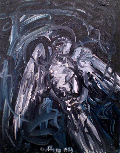
VC: I am understanding a similar thing now, where your painting Standing Before the Mirror 1983 is about color as much as it is about composition, and your painting, Death of the Dove 1983, is reminding me of the void of color which Guernica represents. Is the black and white in this painting about Guernica?
Shane Guffogg: Picasso’s Guernica opened up possibilities about the role art could play. As you recall, I grew up on a bird farm and we had hundreds of thousands of pet birds. My mom liked her doves and canaries. Well, one day I went into the aviary that had the doves, and one had died and was lying on the ground, face down. I thought of Picasso’s famous Peace dove drawing that was made into posters and became the symbol for global peace. But this was 1983 and the United States and USSR were in the middle of a cold war and the looming threat of a nuclear exchange was hanging over our heads like a permanent dark cloud. I picked up the dead dove and took it in to my studio and laid it on the floor next to my easel and painted it, using only black and white. It was a nod to Guernica but the non-colors also represented the absence of life.
Pablo Picasso, Dove of Peace
work on paper, 1953
Shane Guffogg, Death of the Dove
oil on canvas board, 18 x 14″, 1983
VC: I think in the beginning Matisse’s use of color was not welcomed, but over time we can see how it has affected the art which followed. Have you felt influenced by another artist’s use of color? You worked with Ed Ruscha as his studio assistant for many years, did his use of color affect your work? You were also a student of Cal Arts during the ’80s when painting was proclaimed dead, and one of your professors was the late John Baldessari. How did you stay alive as a painter in this vital period and continue to explore color theory? Were there any artists during the American Abstract movement which influenced your choices?
Shane Guffogg: Ed’s choices of colors are more in the primary and sometimes secondary zone, as in red, yellow and blue, and occasionally orange or green. Also, Ed’s work is more about the language of or media-driven era we live in. Even though Ed is seen as a west coast pop artist or a conceptual artist, I think of him as a landscape artist. But his landscapes are the language of our time, and how it is conveyed through print or even over the radio. John is a different type of artist and was not so interested in the act of painting or drawing like Ed. John is also a landscape artist of our time and his images derive from pop culture, which he finds through magazines, film stills, etc. They both did a lot of work using black and white, but that is due to the references to photography. As a painter, black and white are also their own thing and can be instilled with deep emotions.
Ed Ruscha, Ok #1
acrylic on canvas, 60 x 48″, 1990
John Baldessari, Kiss/Panic
black and white photographs with oil tint, 1984
Shane Guffogg, Sapere Aude #9
oil on canvas, 30 x 24″, 2017
Shane Guffogg: Anselm Kiefer is a great example, but we can save him for another time.
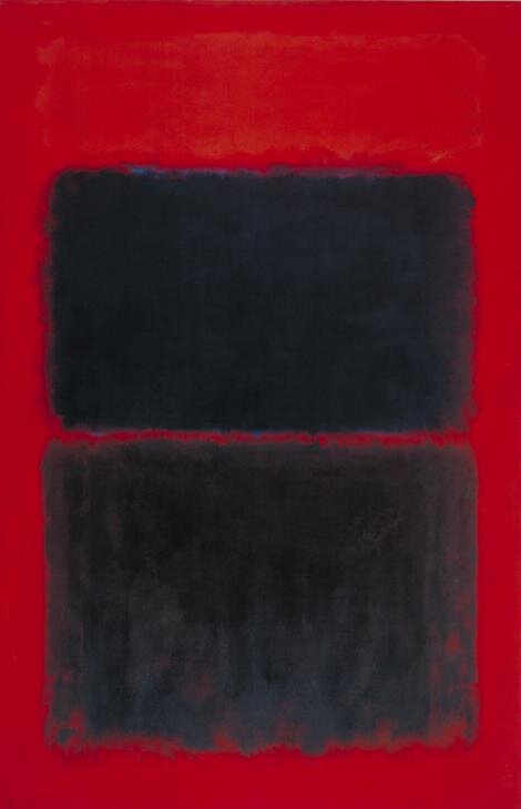
For me, I wanted to do the opposite of what John was doing because I am more of a romantic and believe in the pursuit of higher consciousness through beauty. Ed and I are opposite sides of the same coin. His use of language is really what I am doing, but my language is one that is unspoken and derives from my own physical movements that take place within a real moment in time. With the Ab-Ex artists, I would say first is Rothko, because of the purity of color and how they carried a weight of emotions. Second is a tie between Pollock and de Kooning, both because of the physical-calligraphic nature of how they made marks, and the 4th and 5th would be Clifford Still and Joan Mitchell. Again, because of their use of colors and transference of color via the physical nature of their own body and the way nature and the landscape finds its way back into their work.
Mark Rothko, Light Red Over Black
oil paint on canvas, 90 x 60″ 1957
Jackson Pollock, Autumn’s Rhythm (Number 30)
enamel on canvas, 105 x 207″, 1950
VC: Aww, the abstract expressionist, there is a lot more to talk about!
Stay tuned for Part 5
Victoria Chapman
Studio Manager
Note: all images shown in this email are (fair use) public domain
